Facebook Ad Sizes for Static Images and Carousels
A practical Facebook ad size guide for designers who need feed, full-screen and carousel assets without rebuilding the same idea for every placement.
By Sarmad Mughal · Published · Updated · 9 min read
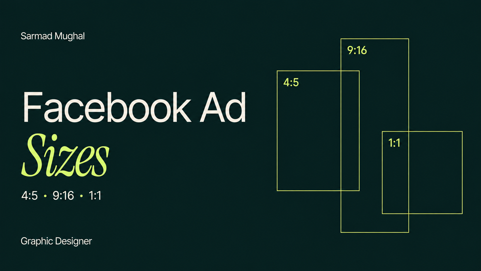
Facebook ad sizes should be a production decision, not a weekly archaeological project.
Meta has many placements, each surrounded by different interface elements and viewed on different screens. That makes the full specification list look more complicated than the work usually needs to be. For most static campaigns, I would build three deliberate layouts: one for feeds, one for full-screen placements and one square version for carousels and square-friendly placements.
The important word is layouts. Resizing a square image to 9:16 does not make it a vertical ad. It makes a square ad with a great deal of new background and a headline wondering why it has been abandoned in the middle.
This guide reflects Meta's published guidance checked in September 2026. Specifications and eligible placements can change, so the final Ads Manager preview is still part of the export process.
Facebook ad sizes at a glance
| Placement or use | Working ratio | Recommended canvas | Practical role |
|---|---|---|---|
| Facebook and Instagram feeds | 4:5 | 1440 × 1800 px | Main portrait feed layout |
| Square feed fallback and square-friendly placements | 1:1 | 1440 × 1440 px | Flexible secondary version |
| Facebook and Instagram Stories | 9:16 | 1440 × 2560 px | Full-screen vertical layout |
| Facebook and Instagram Reels | 9:16 | 1440 × 2560 px | Full-screen vertical layout with protected safe areas |
| Standard carousel cards | 1:1 | At least 1080 × 1080 px | Consistent card system |
These are working canvases, not a promise that every placement will display every pixel exactly as designed. Meta can crop, adapt or expand creative depending on the campaign setup and enabled creative features. Preview the ad by placement before it goes live.
The three sizes I would prepare
1. A 4:5 feed ad at 1440 × 1800 px
For a single-image feed ad, I would start with 4:5. Meta's current Ads Guide recommends 1440 × 1800 px for Facebook and Instagram feed image ads.
The portrait frame gives the concept more vertical room on a phone than a square or landscape image. That extra space is useful, but it is not an invitation to add another paragraph. I would use it to make the product larger, improve the distance between the headline and supporting details, or give the focal point a cleaner silhouette.
A good 4:5 feed layout should still have one obvious first read. The viewer needs to recognise the product, offer or main message while scrolling. A taller canvas cannot rescue weak hierarchy. It just gives weak hierarchy more room.
2. A 9:16 Stories and Reels ad at 1440 × 2560 px
Stories and Reels use a full-screen vertical frame. I would prepare a separate 9:16 layout at 1440 × 2560 px rather than asking Meta to stretch or invent the missing space around a feed design.
The interface is part of the composition. Account information, captions, reactions and call-to-action controls can sit over the creative. Keep the headline, product, offer and logo inside the central safe area, with breathing room at the top and bottom.
Meta provides safe-zone guidance for Reels and recommends keeping key messages inside that protected area. The exact overlay can vary by placement and device, so I would treat the live preview as the final check rather than relying only on guides in a design file.
A static image can be delivered in Reels, but that does not automatically make it native Reels creative. If movement, audio or demonstration matters to the idea, a proper 9:16 video may be a better asset. The size tells the file where to fit. It does not decide which format will communicate the idea best.
3. A 1:1 carousel card at 1080 × 1080 px or larger
For a standard carousel, I would use square cards at a minimum of 1080 × 1080 px. If the production system already uses 1440 px masters, 1440 × 1440 px keeps the same ratio and gives the source artwork more resolution.
Every card should use the same dimensions. More importantly, every card should feel like part of the same sequence. A technically perfect square cannot help if card one introduces a product, card two changes the visual language, and card three appears to have wandered in from another campaign.
The first card needs the clearest hook because it gives someone a reason to swipe. The remaining cards can develop the product, proof, steps or examples. My Meta carousel ads guide explains how I would plan that sequence and what I would test.
Is 1080 × 1080 still a valid Facebook ad size?
Yes, square creative is still useful, particularly for standard carousel cards and placements that favour a 1:1 frame. It can also be a practical fallback when a campaign needs broad placement coverage.
I would not use one square file as an excuse to skip placement-specific design, though. A square asset leaves unused vertical space in full-screen placements and gives feed ads less screen area than a 4:5 version. One file may be convenient for the production folder. The audience does not receive a convenience award.
If time is limited, a careful square layout is better than three badly adapted layouts. If the campaign matters enough to run across feeds, Stories and Reels, it usually matters enough to prepare the formats properly.
How to adapt one concept across the three ratios
The goal is not to create three different ads. It is to preserve one idea while rebuilding the hierarchy for each frame.
Choose the invariant elements
Before resizing, decide what cannot change:
- The main message.
- The product, person or visual proof.
- The offer, if the concept depends on one.
- The brand cues needed for recognition.
Everything else can move. Supporting copy may become shorter. Decorative elements can disappear. The crop can change. A layout adapts better when every object is not treated as legally protected.
Recompose instead of scaling
For a 4:5 feed ad, the focal point and headline may sit as a balanced vertical pair. In 9:16, I might enlarge the product, move the headline toward the upper-middle area and reserve the lower portion for Meta's controls. In 1:1, I would tighten the spacing and remove secondary details before making the important parts smaller.
That is recomposition. Uniformly scaling the complete feed ad until it fits inside a Story is just exporting the problem at a different size.
Protect the main message from cropping
Keep essential content away from the outer edges even when the design uses the full canvas. Meta may show a different crop in feeds, previews or connected placements. Background texture can reach the edge. The product name, price, offer and legal qualifier should not depend on the last few pixels surviving.
If a crop removes something essential, upload a placement-specific asset rather than hoping the delivery system develops an interest in typography.
Static image and carousel export checklist
Before I hand off the files, I would check the following:
- Feed creative uses a deliberate 4:5 layout, not a cropped square.
- Stories and Reels have a separate 9:16 version.
- Standard carousel cards share one square size and a consistent visual system.
- Important text, logos and products have enough distance from edges and interface overlays.
- Headlines remain readable on a phone-sized preview.
- Small disclaimers are still legible after export.
- Images are exported as JPG or PNG in the correct colour profile.
- File names clearly identify the concept, ratio and version.
- Every selected placement has been inspected in Ads Manager.
- Automatic cropping, image expansion and other creative enhancements have been reviewed rather than accepted without looking.
That last point matters. Meta can adjust aspect ratios and expand images through its creative tools. Those features can be useful, especially when asset coverage is limited. They can also change a careful crop, move the emphasis or produce extra space that does not match the original design. Automation still needs art direction.
A simple file-naming system
Dimensions become much easier to manage when the file name explains what the file is.
I would use a structure such as:
`brand_campaign_concept_ratio_version.jpg`
For example:
- `nugevia_energy_product-hero_4x5_v01.jpg`
- `nugevia_energy_product-hero_9x16_v01.jpg`
- `nugevia_energy_carousel-card-01_1x1_v01.jpg`
This is not exciting design advice. It does prevent someone from uploading `final-final-new-2.jpg` into every placement and discovering the crop problem after launch.
Frequently asked questions
What is the best Facebook ad size for a single image?
For Facebook and Instagram feeds, I would use a 4:5 image at 1440 × 1800 px. It gives a static concept a strong mobile presence and follows Meta's current feed recommendation. Prepare separate square and 9:16 versions when the campaign includes placements that need those shapes.
What size should a Facebook carousel ad be?
Use a 1:1 square canvas for standard carousel cards, at least 1080 × 1080 px. Keep every card the same size and design the set as a sequence rather than a collection of unrelated squares.
Can I use 1080 × 1350 px for feed ads?
It has the correct 4:5 ratio and remains common in existing production systems. Meta's current Ads Guide recommends a larger 1440 × 1800 px canvas for feed image ads, so that is the master size I would use for new work. The ratio is the important layout decision, but always confirm the current requirements in Ads Manager.
Can one image run across every Meta placement?
Meta may allow one image to run across several placements and can crop or adapt it. That does not mean the result will be equally strong everywhere. I would prepare separate 4:5, 9:16 and 1:1 layouts when those placement groups matter to the campaign.
Should text stay below 20 percent of the image?
Meta removed the old rule that restricted delivery based on a strict text percentage. That does not make crowded text a good design decision. Keep only the words the image needs, make them readable on a phone and let the primary ad copy or landing page carry the fuller explanation.
Final thoughts
You do not need a different design file for every line in Meta's placement list. You need a small system that respects the main shapes in which the idea will appear.
I would build a 4:5 feed layout, a 9:16 full-screen layout and a 1:1 square or carousel layout. Preserve the message, recompose the hierarchy and check the real previews before publishing.
The correct Facebook ad size helps the idea arrive intact. It cannot make the idea clearer on its own, but at least it stops the platform from cropping the product in half. That is a useful start.
Sources and references
- Facebook Feed image ad specifications — Meta for Business
- Instagram Feed image ad specifications — Meta for Business
- Carousel ad specifications — Meta for Business
- Instagram and Facebook Reels ads — Meta for Business