Meta Carousel Ads: 5 Design Lessons From Live Ads
Five live Meta carousel ads, a practical storyboard and a testing checklist for designers who want every card to have a job.
By Sarmad Mughal · Published · Updated · 10 min read
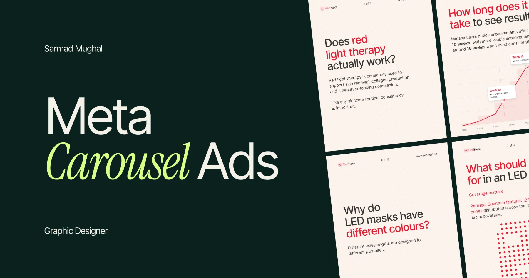
Meta carousel ads are useful when one image would make the message feel incomplete. That does not mean every card needs a new headline, another product feature and a different call to action. That is how a carousel becomes a row of small banners, which is not really a story. It is just a busy way to spend more design time.
The stronger approach is simpler. Give the carousel one job, make the first card earn the swipe, then let the later cards support the same idea.
I reviewed five live ads in Meta Ad Library for this article. I am not claiming to have designed them, and I am not using their creative as decoration here. I am using them as sourced examples to explain the decisions I would pay attention to as a static-ad designer.
The rule I would start with: one carousel, one main message
A carousel has more room than a static ad. It does not have permission to become a tiny landing page.
The first card should communicate the main promise on its own. The cards that follow can add context, proof, product detail or an action. They should not make the viewer work out which of five messages is the important one.
This is the same principle I use in single-image ads. A product, offer or benefit needs a clear place in the hierarchy. A carousel gives you more frames to develop that idea, not a reason to remove the hierarchy.
Meta carousel ad specs and sizes
Specs are the boring part right up until an important line of copy is cropped, a product becomes soft, or the whole sequence has to be rebuilt the day before launch. Very creative.
Use this as a production baseline, then confirm the exact eligible placements and current limits in Ads Manager before final export. Meta updates formats and placement controls, and a feed-safe file is not automatically a Stories-safe file.
| Item | Production baseline | Why it matters |
|---|---|---|
| Carousel cards | 2 to 10 cards | Use only as many cards as the message needs. More cards do not automatically create a better story. |
| Feed image size | 1080 × 1080 px minimum | A square 1:1 master is the dependable starting point for feed cards. |
| Feed video size | 1080 × 1080 px recommended | Keep video cards at the same 1:1 ratio as the image cards in the sequence. |
| Image formats | JPG or PNG, up to 30 MB per card | Export images sharply enough for in-image type and product detail to remain readable. |
| Video formats | MP4, MOV or GIF, up to 4 GB per card | Use video only when movement helps communicate the idea. |
| Primary text | Up to 125 characters | Keep the opening line short enough to work as a second hook above the cards. |
| Per-card headline | Up to 40 characters | Write for scanning, not for squeezing in a second paragraph. |
| Per-card description | Up to 20 characters | Treat it as optional support because it may not appear in every placement. |
For a vertical Stories or Reels variation, prepare a separate 1080 × 1920 px, 9:16 asset set and protect the interface safe zones. Do not stretch a square card into a vertical frame and hope for the best. Meta's Reels guidance also recommends keeping key creative elements inside the safe zone for vertical placements.
Keep the dimensions and aspect ratio consistent inside one carousel. If the product, headline or important proof is framed differently from card to card, the sequence feels broken before anyone reaches the CTA. Meta's current carousel format guidance is the final check before launch.
Five Meta carousel ads and the design lessons I would take from them
The examples below were observed in Meta Ad Library on 25 August 2026. Ad Library creative changes over time, so the library ID is included for source context rather than treating any example as a permanent performance claim.
Webflow: make the announcement the entire job
Source: Webflow, Meta Ad Library ID `2625874067815564`
Webflow's first card says that the full conference agenda is live. I like it because it does not try to explain the entire conference in one frame. The centred text is the focal point, and the surrounding blue and orange conference system supports it without asking for equal attention.
The later cards continue the same typography, colours and visual language. That consistency matters. A carousel should feel like one branded sequence, not a folder of unrelated social posts.
Design lesson: Multiple cards can reinforce one message. They do not need to introduce multiple competing messages.
Zapier: lead with the outcome, not the feature list
Source: Zapier, Meta Ad Library ID `3328979794067876`
Zapier's ad is about a familiar business problem: processes become more complicated as work scales. The first card leads with the outcome, “smooth processes for all,” instead of a stack of automation features.
The design is clean because it gives one large line of copy plenty of space. Zapier's cream background, black type and orange accent are present, but they do not need to perform a small branding recital in every corner. The photography supports the message rather than becoming the subject.
Design lesson: If the benefit is easy to understand, lead with it. Product details and proof can do their work in the next cards.
What I would test: A more specific audience or workflow problem on card one against the broader promise. That changes the idea being tested, not just the colour of a button.
Semrush: give people a reason to swipe
Source: Semrush, Meta Ad Library ID `1597744391950502`
“4 steps to benchmark brand mentions in AI answers” is a useful hook because it promises a small, defined process. The number tells the viewer that the next cards will take them somewhere. That is a better reason to swipe than “learn more,” which is technically a request, not an idea.
The phone visual also helps. It makes the topic feel connected to a real product workflow rather than a text-only tip. The next card uses a step label, so the sequence is easy to understand even if someone lands on a later card.
Design lesson: A numbered process can create swipe momentum when the audience wants to learn how to do something specific.
What I would test: An outcome-led opening, such as seeing how a brand appears in AI answers, against the current process-led hook. Both are valid directions, but they answer different audience motivations.
Wix Studio: use motion only when it makes the idea clearer
Source: Wix Studio, Meta Ad Library ID `25969873592688981`
Wix Studio's core message is solid: a design should look sharp on every screen. I would still test an image carousel instead of the video-led execution shown in the first card.
The play button makes the viewer decide whether to watch before the message has fully landed. A static opening card could compare the same website on desktop and mobile, then use later cards to show the responsive controls and outcome. For this idea, that may be faster to understand while someone is scrolling.
This is not an argument against video. Video is useful when motion is the proof. It is a bad habit to use video simply because the format is available.
Design lesson: Choose the format that communicates the idea fastest. Motion is not automatically clarity.
Mejuri: atmosphere is useful, but the product must still be obvious
Source: Mejuri, Meta Ad Library ID `1044978145095669`
Mejuri's carousel uses lifestyle imagery to create a feeling around its jewellery. The issue I see is product prominence. My eye reaches the faces and hair before it reaches the rings or earrings. The images are attractive, but the thing being sold is not immediately the hero.
I would lead with one jewellery piece shown clearly on a clean background, then use the lifestyle images in later cards to show how it is worn. The carousel can have both clarity and atmosphere. They just need the right order.
Design lesson: Lifestyle imagery can create feeling, but the product still needs to be easy to identify quickly.
A six-part carousel structure that keeps people moving
An engaging carousel is not a longer carousel. It gives the viewer a reason to continue, then rewards the next swipe with useful progress. Start with one audience, one problem and one solution. That is usually clearer than trying to speak to everyone with a list of loosely related benefits.
Not every carousel needs six cards. A simple offer may need two or three. But when the message benefits from a fuller sequence, this is the structure I would start from.
| Card | Job | What it should answer |
|---|---|---|
| 1 | Hook | Why should I stop and swipe? |
| 2 | Context | What problem, situation or opportunity is this about? |
| 3 | Breakdown | What is the useful step, product detail or mechanism? |
| 4 | Proof or payoff | Why should I believe it, or what changes for the customer? |
| 5 | Recap or bonus | What useful point makes the swipe feel worthwhile? |
| 6 | Next step | What should they do or learn next? |
The exact order can change. A product carousel may show the product first. A case-study carousel may lead with a verified result. Do not invent results or turn a vague claim into fake proof just because card four needs something persuasive. If you do not have substantiated results, use a clear product demonstration, customer quote you are allowed to publish or a practical takeaway instead.
The point is that every card has a role. If card three says the same thing as card two with a different background, it probably does not need to exist. If the final CTA asks for a big commitment before the carousel has delivered anything useful, it is probably arriving too early.
A portfolio principle I would carry into a carousel
One of my D2DCRM static ads makes the mobile CRM interface the product hero. It is not a carousel, and I would not pretend otherwise. But the principle carries over: if the interface is the product, do not shrink it into background texture while several other messages compete for attention.
If I adapted that product-first approach into a carousel, I would test a short sequence like this:
- Card one: one clear promise, such as a CRM and knocking app in one place.
- Card two: one enlarged interface view that makes the product real.
- Card three: one specific outcome or use case, with the next action.
That is more useful than placing three tiny screens, six feature labels and a CTA into every card. The product needs room to be understood. The landing page can carry the fuller explanation after the click.
My pre-launch checklist for Meta carousel ads
Before sending a carousel into review, I would check these points.
- Can someone understand the first card without swiping?
- Is there one main message, rather than several headlines fighting for first place?
- Is the product, offer or proof easy to find?
- Do the cards use the same typography, colour system and visual language?
- Does each later card add something new to the story?
- Is any video card earning its place through motion, rather than adding a play button to a message that should have been static?
- Have I checked that the creative still feels connected to the landing page and brand experience after the click?
Meta's carousel format and placement controls can change, so verify the current requirements in Ads Manager and Meta's carousel format guidance before building final files.
Test a different idea, not a different shade of blue
Carousel testing becomes useful when the variation can teach you something.
Start by testing one clear variable at a time:
- A process-led hook versus an outcome-led hook.
- A product-first opening versus a lifestyle-first opening.
- A fixed story sequence versus a proof-led sequence.
- A static first card versus a video first card when motion may or may not add clarity.
I would not begin by making ten versions where only the accent colour or logo size changes. Those edits can matter later, but they rarely tell you whether the core message was the right one.
Final thoughts
The best Meta carousel ads use extra cards with purpose. They start with a clear reason to swipe, keep the design system consistent, make the product or proof easy to find and move the viewer through one idea instead of several disconnected claims.
Start with the job of the carousel. Then give every card a job inside it. That is a much better use of the format than treating it as five places to paste more information.
If you need a graphic designer specializing in static Meta ads for B2B and DTC brands, you can view my work or contact me about a project.
Sources and references
- Meta carousel ad format guidance — Meta for Business
- Facebook and Instagram Reels ad guidance — Meta for Business
- Meta Ad Library — Meta