15 Static Ad Examples: A Meta Ad Designer's Breakdown
A practical breakdown of 15 static Meta ad examples from my portfolio, including the hierarchy, hook, offer and design decisions behind each one, plus what I would test next.
By Sarmad Mughal · Published · Updated · 19 min read
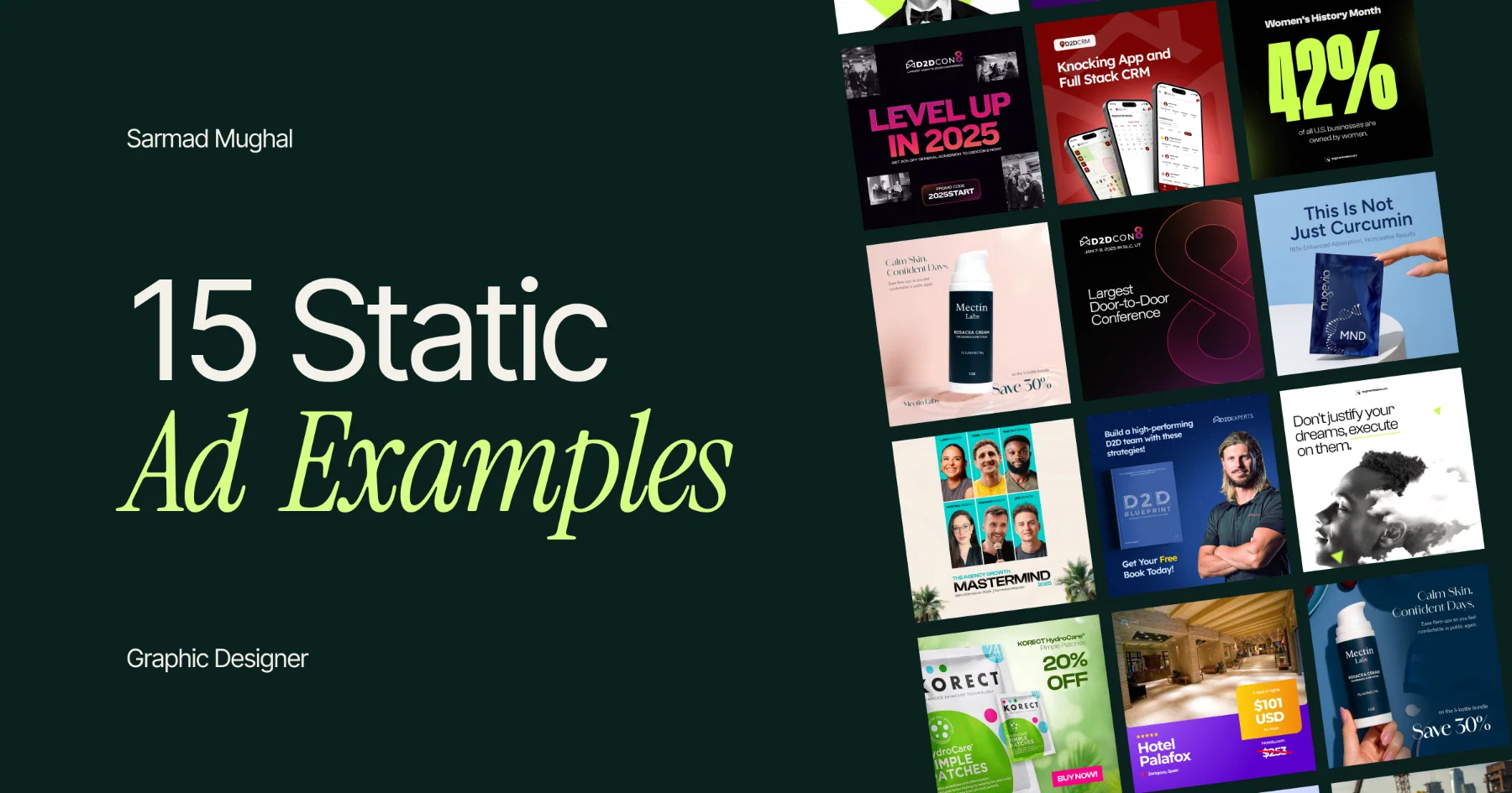
A static ad is a single-image advertisement. It does not rely on video, animation or a carousel to communicate the idea. One frame has to carry the product, message and visual hierarchy clearly enough for someone to understand it while scrolling.
That sounds simple. It usually isn't.
The strongest static ads are not necessarily the ones with the most information or the most polished effects. They normally have one clear job. They introduce a product, lead with a benefit, establish credibility, present an offer or make one reason to click easy to understand.
The 15 Facebook and Meta static ad examples below come from my own design portfolio. They cover B2B software, conferences, lead magnets, education programs and supplements. I designed the ads and, depending on the project, also developed different concepts, layouts, variations and sizes.
I will break down what each ad is trying to do, the main design decision behind it and what I would test next. This is design analysis, not a collection of made-up conversion claims.
A quick note about performance
I do not have performance data for most of these ads, so I will not pretend every design was a winner. A polished portfolio image can show how an idea was communicated. It cannot tell you the click-through rate, cost per lead or return on ad spend.
The D2DCon creatives were part of advertising work for an event that sold more than 1,700 tickets. That is a real campaign outcome, but the design did not achieve it alone. The offer, copy, targeting, landing page, funnel, checkout and wider campaign all mattered.
For Nugevia, I have five-star client feedback: “Quality work. highly recommend!” That tells you the client was happy with my work. It is not a performance metric.
This distinction matters. Ads operate inside a system, and design is one part of that system.
The 15 examples at a glance
| # | Static ad example | Main approach | What I would test next |
|---|---|---|---|
| 1 | D2DCRM integrated knocking app | Product interface as the hero | A shorter, outcome-led headline |
| 2 | D2D Blueprint free book | Clear offer hierarchy | A larger book and one specific benefit |
| 3 | D2DCRM feature ad | Multiple screens to show product breadth | One screen and one feature |
| 4 | D2D Blueprint with expert | Authority plus a tangible lead magnet | Expert-led versus book-led layouts |
| 5 | D2DCon positioning ad | Minimal category leadership message | One practical reason to attend |
| 6 | AI Partner Trustpilot ad | Reviews as the creative concept | One shorter, specific testimonial |
| 7 | Nugevia MND product hero | Product-led simplicity | A benefit-led or lifestyle version |
| 8 | D2DCon promo-code ad | Event energy plus a direct offer | A larger discount and fewer photos |
| 9 | Nugevia PWR benefit ad | Human presence plus product | A larger product and less support copy |
| 10 | Nugevia MND educational ad | Product introduction plus proof | One benefit per variation |
| 11 | Authority Method pain-point ad | Direct-response question and proof | Lead with the revenue figure |
| 12 | D2DCon category-authority ad | Bold claim with event photography | Add date, location or a clearer action |
| 13 | D2DCon minimal event ad | Restrained positioning | Add a benefit-led supporting line |
| 14 | Authority Method program ad | Structured promise, credibility and CTA | Shorter headline or proof-led hook |
| 15 | Nugevia MND differentiation ad | Product plus technical differentiator | Higher contrast and more product space |
1. Make the software interface the product
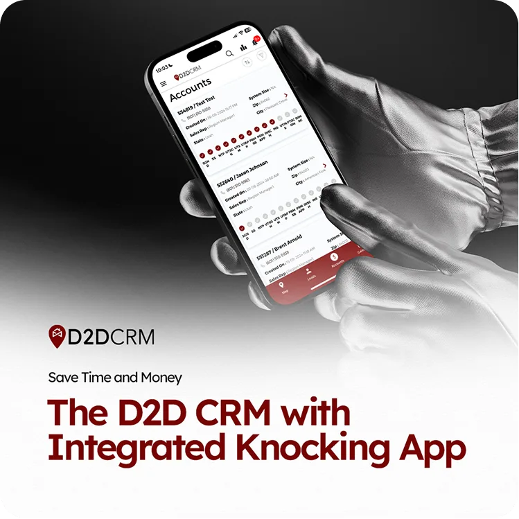
D2DCRM product ad built around the mobile interface.
This D2DCRM ad needs to explain that the product combines a CRM with a knocking app. Software ads often become a collection of tiny screenshots, feature labels and interface callouts. That may prove the product has many features, but it can also make the ad impossible to read on a phone.
I used one enlarged phone interface as the main visual. The black-and-white hand image gives the design a technical, premium feel, while the dark red headline reconnects it to the D2DCRM brand. The interface is visible enough to make the product real without asking someone to inspect every detail.
I would test a shorter headline such as “CRM + Knocking App in One.” I would also try a version with slightly more separation between the phone and message. The current version explains the feature. A shorter version may communicate the same idea faster.
Design lesson: If the interface is the product, show it clearly. Do not turn it into background texture.
2. Give a free offer one obvious point of emphasis
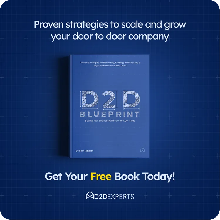
Lead-generation ad for the D2D Blueprint free book.
This is a lead-generation ad for a free book about scaling a door-to-door company. The visual hierarchy has three parts: the promise at the top, the book in the center and the offer at the bottom.
The book is treated as a real product rather than a decorative mockup. The blueprint grid supports the subject and brand without fighting for attention. Yellow is used only for the word “Free,” which makes the offer easy to find.
That restraint matters. If every line had a different color or every benefit received the same visual weight, the viewer would have to decide what matters. That is the designer's job.
I would test a larger book with a shorter top line. I would also replace the broad growth promise with one specific idea from the book. A precise benefit may give the audience a stronger reason to download it.
Design lesson: When the offer is simple, make the hierarchy simple too.
3. Show product breadth without building a UI collage
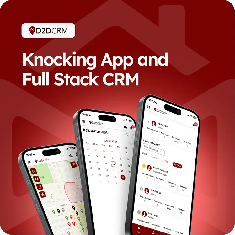
Feature-led D2DCRM ad using multiple mobile screens.
This variation shows three parts of D2DCRM at once. The angled phones communicate that the platform covers more than one task, while the large white headline explains the overall product before someone reaches the interface details.
The red gradient and oversized background symbol keep the design recognizably on-brand. More importantly, the screens are grouped as one visual unit. They do not look like three unrelated screenshots placed wherever space was available.
The tradeoff is speed. More screens can communicate breadth, but each screen becomes smaller. I would test this against a version with one phone, one feature and one outcome. The multi-screen ad says, “The product does a lot.” The single-screen version could say exactly what one useful feature helps the customer do.
Design lesson: Use multiple screens to communicate breadth. Use one screen to communicate depth.
4. Test authority against the lead magnet itself
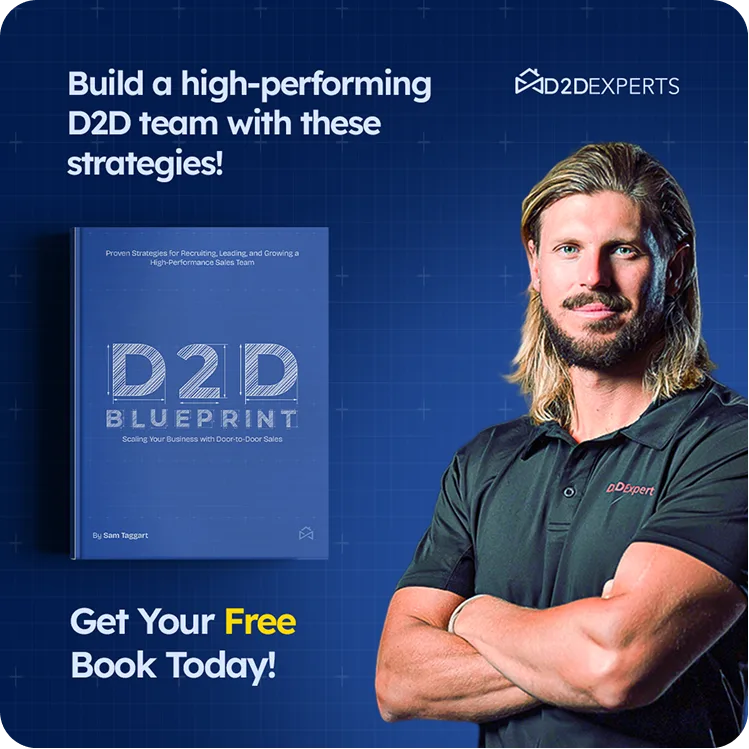
Authority-led variation of the D2D Blueprint lead-generation ad.
This ad promotes the same free book as example two, but the composition introduces the expert behind it. The portrait adds trust and human recognition. The book still makes the offer tangible, and the yellow “Free” keeps the promotional message visible.
The challenge is that the person and the book both want attention. That is not automatically wrong, but it creates a useful testing opportunity.
I would make two clearer variations. One would lead with the expert and use the book as supporting proof. The other would make the book dominant and reduce the portrait. This is a more meaningful test than changing the button color or moving the logo five pixels. Those changes create new files. They do not always create new ideas.
Design lesson: If two elements compete for attention, turn that tension into separate concepts and test them.
5. Use minimal design for category positioning
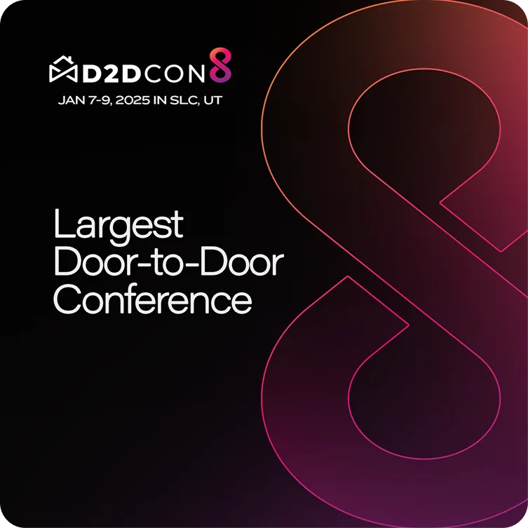
Minimal D2DCon ad positioning the event as the largest conference in its category.
This D2DCon ad has very little copy. Its job is to establish category position and make the event identity memorable.
The oversized outlined “8” is the main visual device. It comes directly from the event identity, so it feels branded rather than added for decoration. The black background, white typography and pink-orange outline create enough contrast to make a minimal composition feel deliberate.
This approach works best when the audience already understands the category or has some awareness of the event. For a colder audience, “Largest Door-to-Door Conference” may not be enough. I would test one practical reason to attend, such as the speakers, audience or networking value.
This was one of the creatives connected to the D2DCon campaign discussed earlier. Again, the event's 1,700-plus ticket sales belonged to the complete campaign, not one square image.
Design lesson: Minimal design still needs a clear strategic job. Empty space is not a strategy by itself.
6. Turn social proof into the actual concept
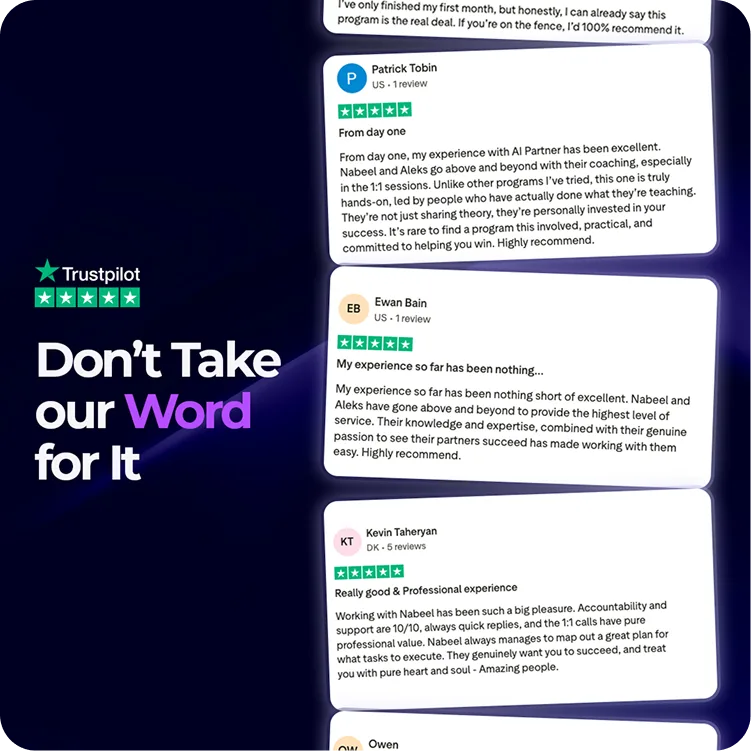
AI Partner ad using Trustpilot reviews as the central argument.
Many ads include a small review near the bottom after the headline, product, benefits and CTA have already taken the best space. This AI Partner concept does the opposite. The reviews are the ad.
“Don't Take Our Word for It” frames the idea immediately. The angled cards create movement, and the purple emphasis on “Word” guides the eye without competing with Trustpilot's recognizable green.
The obvious risk is mobile readability. Detailed reviews can feel credible, but a person may not stop long enough to read several paragraphs inside an ad. I would test one short, specific testimonial against this stacked-review version. The shorter version would sacrifice volume but could make the proof easier to process.
Design lesson: If social proof is your strongest argument, let it lead. Just make sure it can still be read at feed size.
7. Let the product own the frame
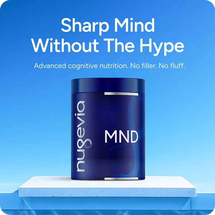
Product-led Nugevia MND ad with a simple cognitive-nutrition message.
This Nugevia ad is built around one product, one headline and one supporting sentence. The centered pack and symmetrical platform make the product unmistakably dominant.
The blue tonal palette connects the background to the packaging. White text creates strong contrast, while “Sharp Mind Without The Hype” positions the product without covering the frame in ingredient details.
This is close to how I prefer to structure many product ads. Make the product prominent, communicate one idea and let the landing page handle the complete explanation. An ad is not a tiny landing page wearing a square costume.
I would test a shorter benefit-led headline and a warmer lifestyle variation. The current studio treatment feels controlled and premium. A human-context version could create a different kind of connection without changing the product promise.
The client left five-star feedback on the Nugevia work: “Quality work. highly recommend!”
Design lesson: A clear product hero can do more work than several supporting images competing for space.
8. Decide whether the theme or the offer should lead
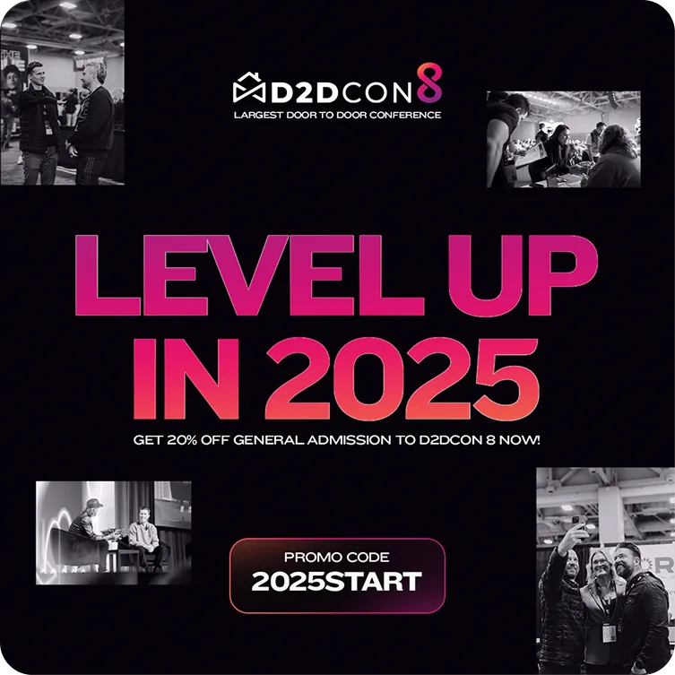
Offer-led D2DCon ad promoting a discount code for conference tickets.
This D2DCon variation combines an event theme, four conference photographs, a 20% discount and a promotional code. “LEVEL UP IN 2025” provides the emotional hook, while the code sits inside its own high-contrast container.
The monochrome photos add event atmosphere without introducing extra colors. That helps the gradient headline and promo code remain part of one consistent visual system.
There are still two possible priorities in this ad. One is the theme. The other is the discount. I would test a conversion-focused version where “20% Off” becomes the largest message, supported by one strong event photograph. That would tell us whether the audience responds more to aspiration or immediate value.
Design lesson: When an ad contains both a campaign theme and a direct offer, decide which one deserves first place.
9. Add a person without losing the product
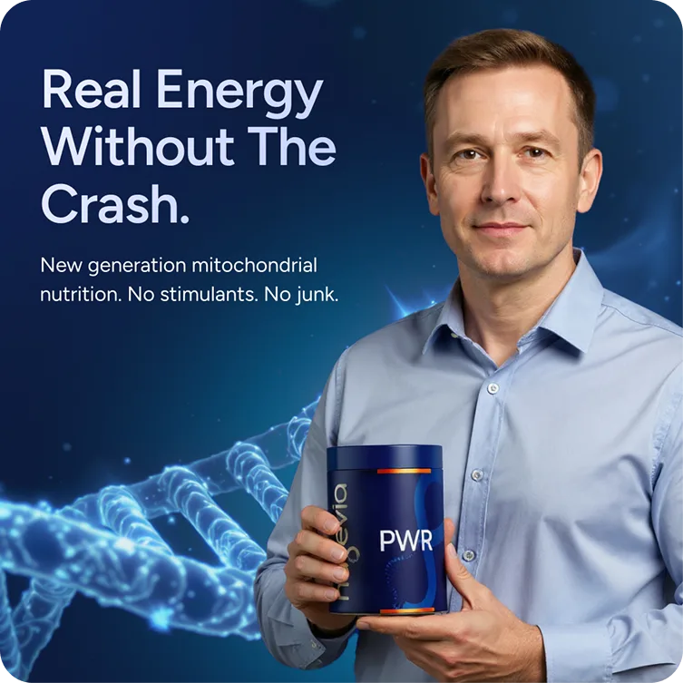
Human-led Nugevia PWR ad built around an energy-without-the-crash benefit.
This Nugevia PWR ad adds a person while keeping the product in the frame. The human presence creates scale and trust, and the scientific background supports the mitochondrial-nutrition message without becoming the main subject.
The headline “Real Energy Without The Crash” is the strongest part of the hierarchy. It communicates a familiar problem and benefit without requiring someone to understand the product science first.
I would test making the container larger and reducing the supporting sentence. Another version could use only “No stimulants. No crash.” The current ad gives context. A shorter variation would test whether speed matters more than explanation for this audience.
Design lesson: People can make a product ad feel more relatable, but the product should not become a tiny accessory in its own advertisement.
10. Separate education into multiple ads
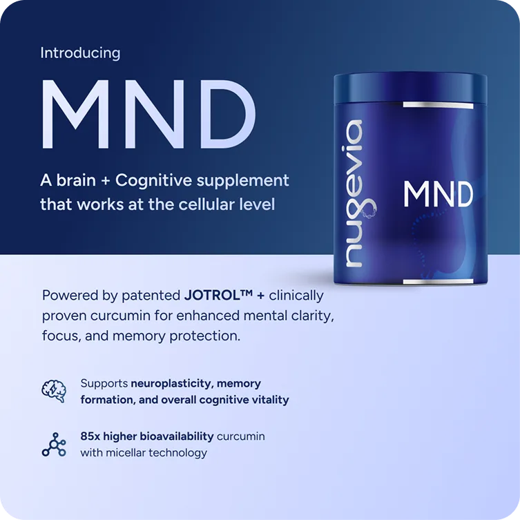
Educational Nugevia ad combining a product introduction with ingredient and benefit information.
This MND example has a more educational job. It introduces the product, explains its patented ingredient approach and lists cognitive benefits.
The composition is divided into two zones. The darker top section introduces the product, and the lighter lower section organizes proof using icons. This creates a readable structure despite the amount of information.
It is also the clearest example of something I would simplify now. There are several useful ideas here, but they do not all need to live inside one ad. I would create separate variations for the ingredient, absorption claim and cognitive benefit. Each version could use a larger product image and send the reader to the landing page for the technical detail.
Design lesson: If an ad contains three persuasive ideas, you may have three ads rather than one crowded ad.
11. Lead with a commercial pain point

Pain-point ad for an expert-education offer.
This ad speaks to experts who are tired of competing on price. The question-led headline starts with a commercial frustration rather than explaining the program.
The portrait creates a human focal point, while the purple-black background keeps the white copy readable. The orange-pink CTA is the only warm element, so it remains visible even in a fairly information-heavy layout.
The ad includes a pain point, positioning statement, audience figure, revenue figure and CTA. Each point may be useful, but together they create several possible hooks. I would reduce the support copy and test the revenue figure as the main headline in a separate variation.
Design lesson: A direct pain point can earn attention quickly. Supporting proof should strengthen it, not compete with it.
12. Combine a category claim with real event context
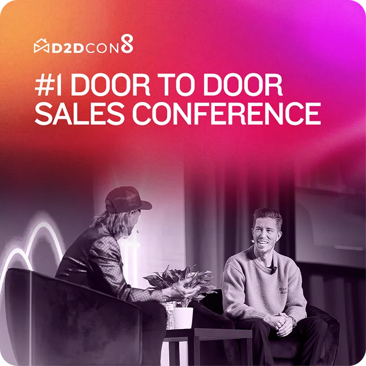
D2DCon positioning ad using stage photography from the event.
This D2DCon ad pairs a bold category claim with an actual event image. The gradient headline is dominant, while the black-and-white stage photograph shows what the conference feels like without competing with the message.
Using genuine event context matters here. A generic conference image could communicate “business event,” but it would not build the same continuity between the ad and the real experience.
The current version is strongest as an awareness or recognition ad. For people encountering D2DCon for the first time, I would test adding the date and location or a clearer next action. That would give the claim somewhere to go.
Design lesson: A bold positioning statement becomes more believable when the visual provides relevant context.
13. Use restraint, then test a reason to act
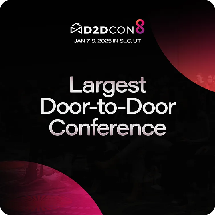
Minimal D2DCon variation using a central message and subtle event photography.
This version uses even more restraint. The logo and date sit above the central claim. A dark event photograph adds atmosphere, and two gradient corner shapes provide enough brand color to frame the message.
The hierarchy is clean because almost everything supports one sentence. Nothing is trying to become a second headline.
The limitation is the same one minimal event ads often face. The viewer understands what the event claims to be, but may not know why to attend. I would test a benefit-led supporting line or direct CTA beneath the main message, especially for colder audiences.
Design lesson: Simplicity can improve comprehension, but clarity about the category is not always the same as motivation to act.
14. Build credibility without stacking every proof point

Program ad combining an outcome-led headline, credibility cue and CTA.
This ad promotes a structured 90-day program for experts. The darkened podcast image creates context while preserving legibility. The headline carries the promise, the Forbes and Entrepreneur mention adds a credibility cue, and the gradient CTA becomes the clearest color accent.
The design contains several layers of persuasion: authority, time frame, outcomes and action. I would test a shorter headline and remove one layer of supporting copy. I would also test the publication proof as the main hook instead of keeping it in a smaller badge.
That would create two genuinely different concepts. One leads with the program. The other leads with credibility.
Design lesson: Proof works best when it has a defined role. Adding more badges does not automatically create more trust.
15. Make a technical differentiator feel tangible
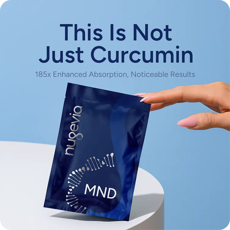
Nugevia MND differentiation ad built around enhanced absorption.
This Nugevia ad differentiates MND from generic curcumin products. The hand and angled pouch introduce movement into a static image and make the product feel tangible. The pale blue background keeps the dark packaging prominent.
“This Is Not Just Curcumin” creates curiosity, and the support line explains the technical reason. The concept is already simple enough to work with less copy than the more educational MND example.
I would increase the contrast of the absorption line and give the product slightly more space. I would also test a version where the differentiator becomes the headline and the curiosity line moves into the primary text outside the image.
Design lesson: A technical claim is easier to process when the visual remains simple and product-led.
What these static ads have in common
The examples look different because the brands and campaign objectives are different. Still, several principles appear repeatedly.
One main idea comes first
The ad may include supporting information, but the viewer should not have to choose between three headlines. Product, benefit, proof, offer and CTA can all appear in a campaign. They do not all need equal importance in every image.
The product or offer is easy to find
In the software examples, the interface acts as the product. In the supplement examples, the package is physically prominent. In the lead-generation ads, the free book is treated as something valuable and tangible.
If the audience cannot quickly identify what is being offered, extra decoration will not rescue the message.
Contrast supports comprehension
I often use dark backgrounds with light text because the contrast makes the message easier to read. The exact colors can change, but the principle remains the same. The important words need enough visual separation from the background and from the supporting copy.
The ad still looks like the brand
I want the ad to feel connected to the website or landing page someone sees after clicking. That means following the brand guide, using the right visual language and presenting the product honestly.
When the ad and landing page look like they belong to different companies, the click can feel like a bait and switch even when the offer is legitimate.
Variations test ideas, not just decoration
Changing a color, crop or button can be useful, but those are not always meaningful creative tests. A stronger variation may change the hook, focal point, amount of information or type of proof.
I would rather compare a product-led ad against a human-led ad than create five nearly identical layouts and call it a creative strategy.
What I would simplify in future variations
Looking back at these ads, the main change I would make across several concepts is reduction.
I would use less text, make the product or primary image larger and give each variation one job. If the brief includes six benefits, that does not mean all six need to fit into one square. The extra detail belongs in the primary ad copy, landing page or another creative variation.
The job of the static ad is to stop the right person, communicate a relevant idea and earn enough interest for the next step. The landing page can explain the complete product and handle the fuller conversion process.
This is also why good static ad design starts before opening the design software. I need the brief, product information, website or landing page, brand guidelines, assets and copy. Sometimes I also help develop copy ideas with AI, but the final message still needs to be specific to the product and audience.
Frequently asked questions about static ads
What is a static ad?
A static ad is a single-image advertisement without video or animation. On Meta platforms, it commonly combines a visual, headline or offer, branding and supporting primary text supplied through the ad setup.
What makes a good static ad?
A good static ad communicates one relevant idea quickly. It uses clear hierarchy, readable contrast, appropriate branding and a visual that supports the message. Its effectiveness still depends on the offer, audience, copy, placement and landing page.
How much text should a static ad contain?
There is no useful universal word count. Use enough text to communicate the main idea, but avoid turning the image into a compressed sales page. If every detail feels essential, split the ideas into multiple ads and test them separately.
Do static ads need a CTA inside the image?
Not always. Meta placements can display a CTA outside the image, and some designs work better without a second button inside the creative. An in-image CTA can help when it improves clarity, but it should not be added automatically to every layout.
Are static ads only useful for ecommerce brands?
No. The examples above include B2B software, conferences, lead magnets, education programs and supplements. Static ads can support awareness, lead generation, product education, offers and retargeting across many industries.
How many static ad variations should a campaign test?
There is no magic number that fits every budget and campaign. The important part is making the variations meaningfully different. Test distinct hooks, focal points, offers, proof types or layouts instead of producing several files that communicate the same idea.
Final thoughts
The best static ad is not always the one a designer likes most. It is the one that communicates the right idea to the right audience and contributes to the campaign's objective.
Start with one clear message. Make the product or offer easy to find. Use contrast to support readability. Keep the creative connected to the landing page. Then test ideas that are different enough to teach you something.
Sources and references
- Meta photo ad format guidance — Meta for Business